The Symbolism of the Color Gray
Gray is considered neutral and dull — and is precisely for that reason one of the most interesting colors there is. It holds everything that cannot quite be named.
–
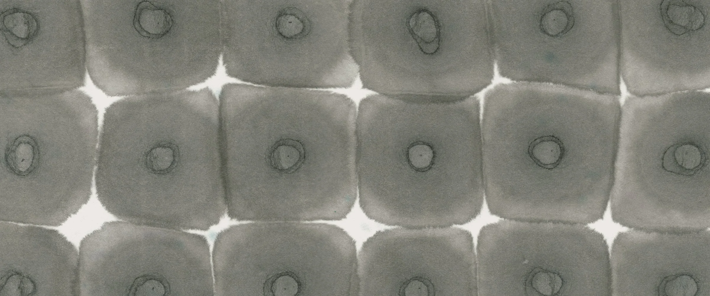
The colorful grays of Sumi ink
>
How We Perceive Gray
Gray describes all stimuli between white and black that produce no chromatic impression, only neutral gradations in brightness. The three color receptors in the eye are stimulated with equal intensity: full stimulation gives white, none gives black. Gray is therefore an achromatic color — terms like pure gray or neutral gray emphasize the absence of any tint. The human eye is said to distinguish up to sixty shades of gray.
Gray is easily influenced by what surrounds it. Placed next to a more saturated color, it takes on the complementary hue of its neighbor — an effect known in color theory as simultaneous contrast. Gray never appears entirely on its own terms.
Grays with a slight tint are usually counted among the grays as well, though strictly speaking this is not correct. Such mixtures are called cool gray (bluish) or warm gray (brownish or reddish). Grays with a stronger chromatic component have names of their own: ash gray, cement gray, field gray, dove gray, smoke gray, slate gray.
+
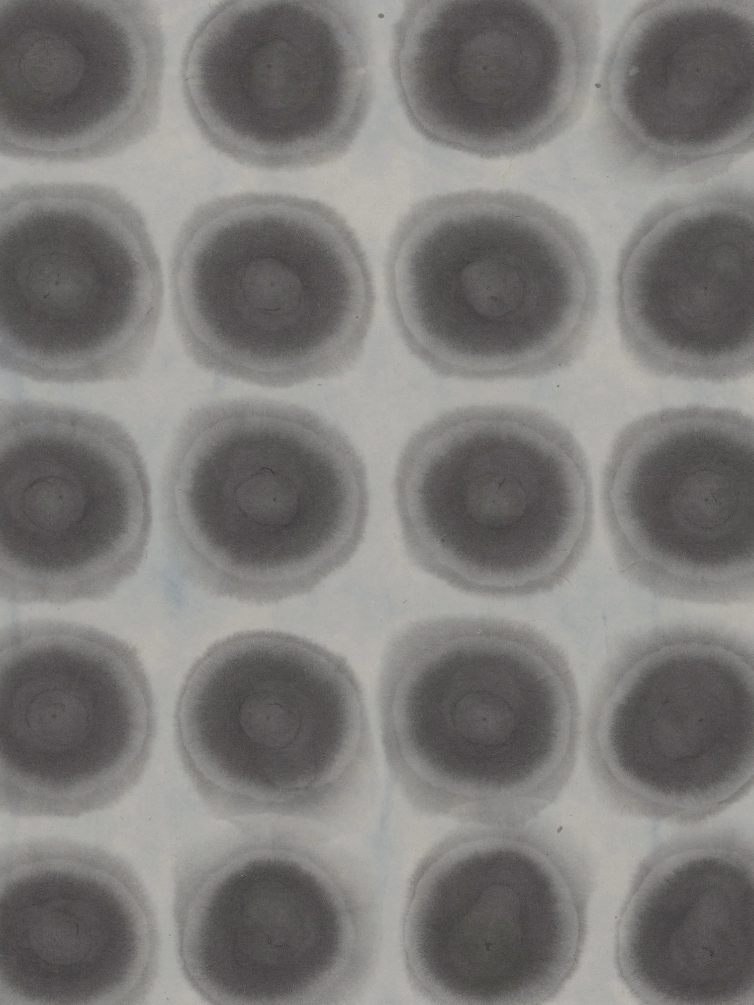
detail from Soft Spots | Breath Meditation N°99
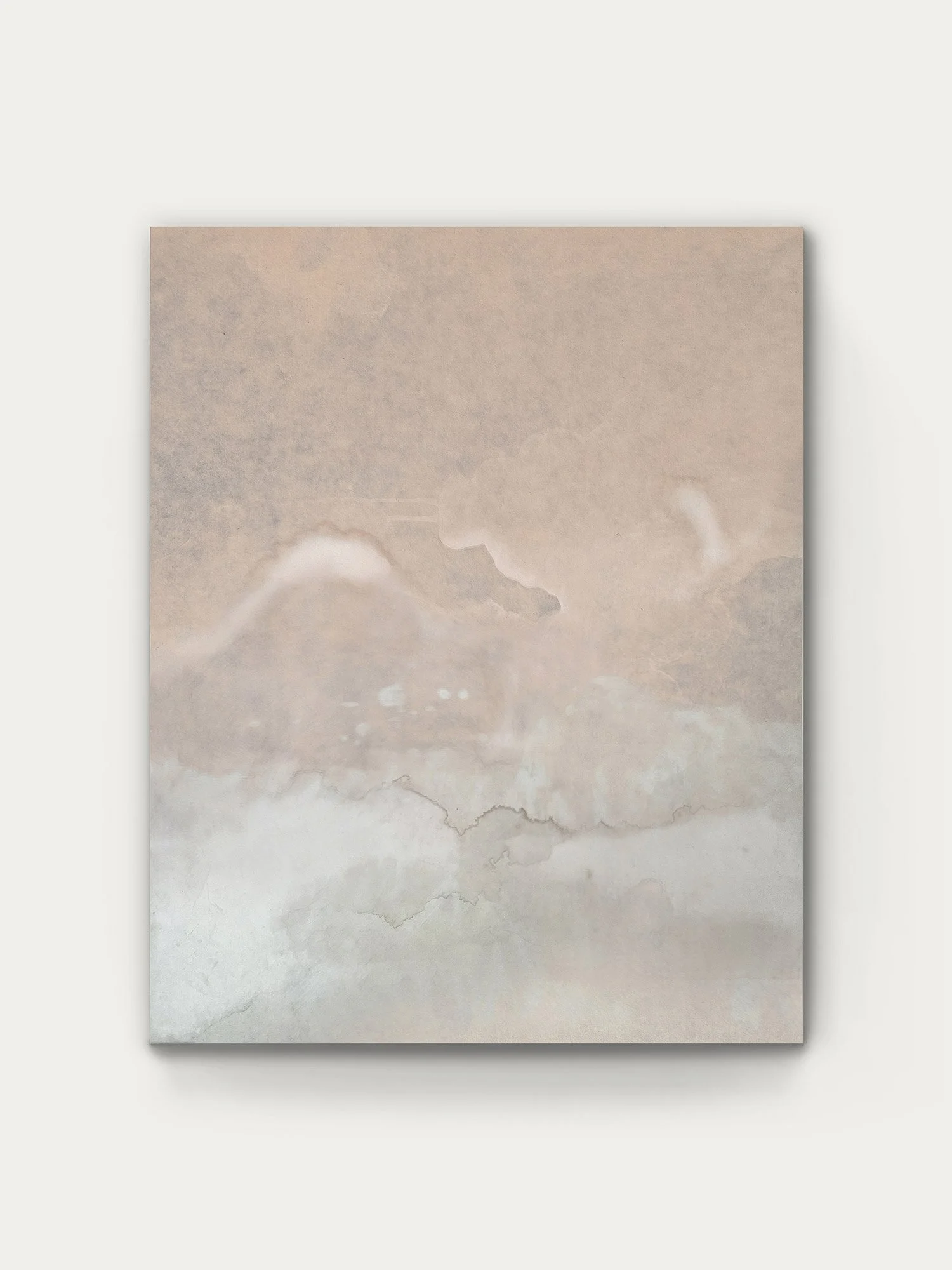
Ancient Clouds | Contemplation N°84
[
A Hundred Grays
In Edo-period Japan, sumptuary laws restricted the use of bright colors for large parts of the population. Fashion responded not with restraint but with refinement: a vast spectrum of grays and browns emerged, proverbially known as the forty-eight browns and the hundred grays — shijūhaccha hyakunezumi. Each shade carried its own name — silver gray, wisteria gray, and dozens more, most of them built on the word nezumi, mouse.
What began as a restriction became a culture of subtlety. Limitation produced richness — and taught the eye to see distinctions where it had assumed there were none.
The Value of Gray
Gray stands between all colors, connecting and neutral. It is considered indifferent and without value — but our reading of it is anything but. Depending on mood and shade, we experience gray as refined, luxurious, elegant and contemporary, or as old, shabby, sad, dirty and inconspicuous. We rarely encounter this “non-color” with genuine neutrality — although strictly speaking, that would be its very definition.
/
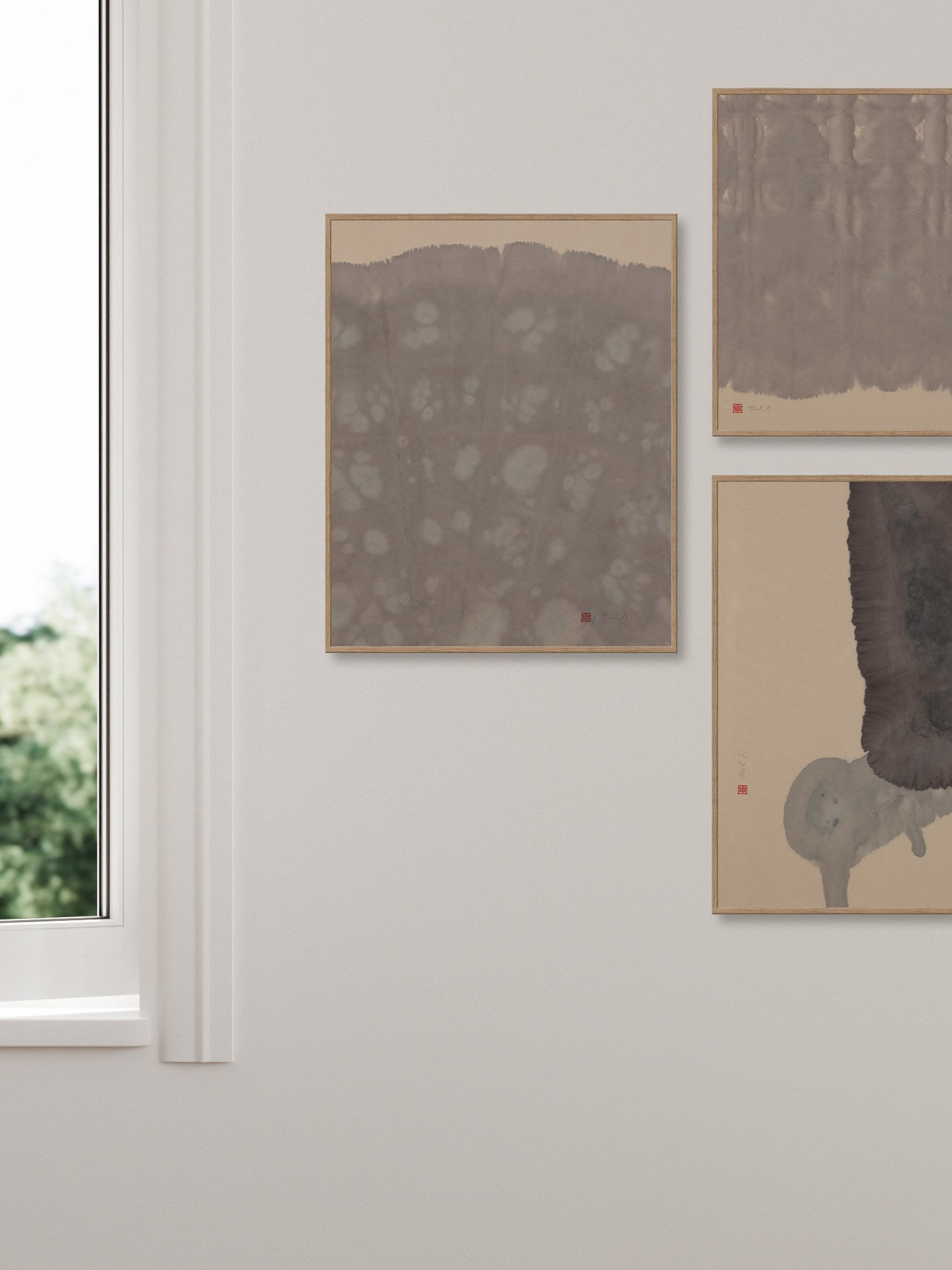
Three Paintings using Sumi ink
The Unknown and the Ghostly
In the gray zone lies everything undefined: neither bad (black) nor good (white). What cannot be judged, defined or categorized hides behind a gray veil, in the gray haze of dusk — between light and darkness. There is something unsettling about this state, and so it comes as no surprise that gray serves symbolically as a gathering place for the unexplained, the uncanny, the ambiguous.
Gray is the color of death, of mourning, of melancholy and transience. Everything appears gray in gray. Here too the color stands for a passage, an intermediate state.
And there is a curious symmetry in this: the two colors most associated with life — green for vegetation and red for blood — correspond in their brightness, and when mixed, to exactly this neutral gray.
<

Breath Meditation N°63
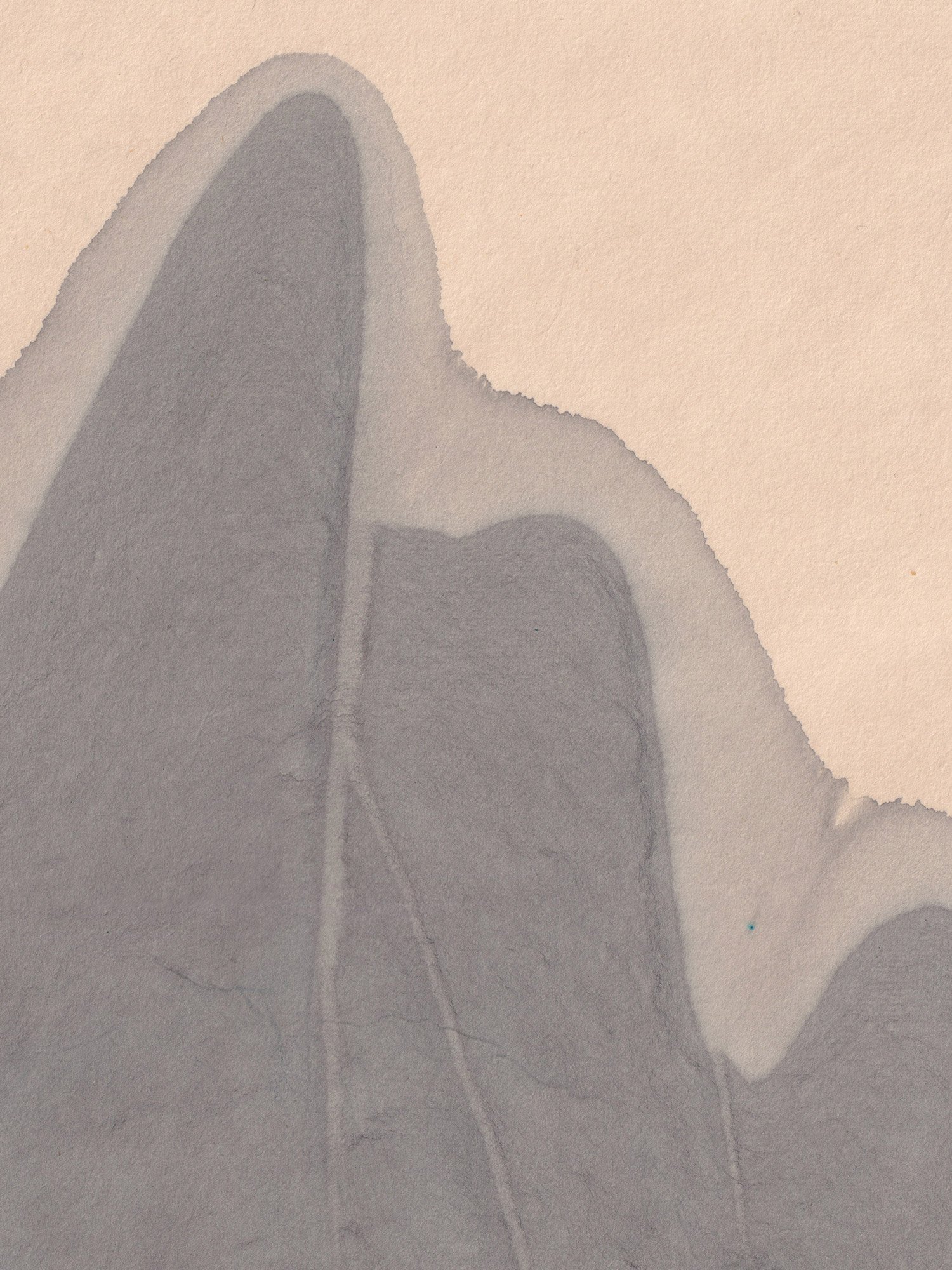
detail from Contemplation N°24
:
Curious about other Colors? (coming soon)
> Red
> White
> Yellow
> Orange
> Purple
> Blue
> Turquoise
> Green
> Brown
> Black
> Gray
> Silver
> Gold